Urbanwallah
A Breakthrough Branding Exercise For Urbanwallah
THE NEED
Instilling Trust in a Tech-Driven Vegetable Marketplace
Urbanwallah entered a competitive space connecting local vegetable vendors directly with customers through a digital platform. The challenge? Convincing users to trust a new-age tech interface for something as traditional and tactile as buying fresh produce. The brand needed a face that felt both modern and familiar a design solution that humanized tech and simplified trust.
What we did ?
- Branding
- Brand Visual Language
VISUAL BRAND POSITIONING
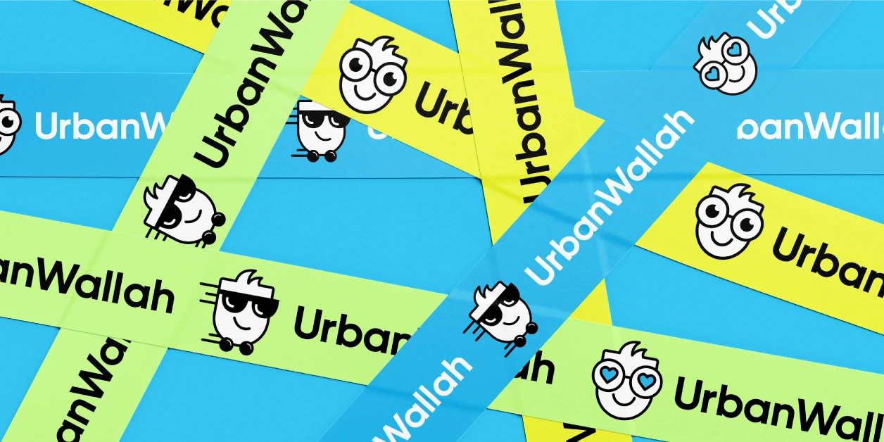
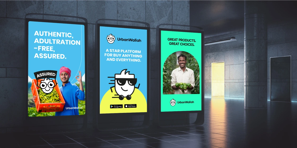
Crafting Familiarity Through a Trust-Built Mascot
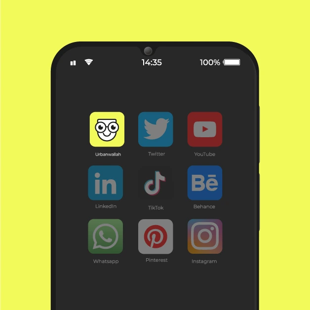
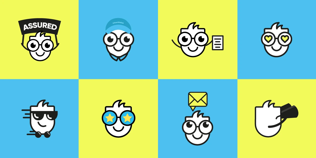
To bridge the gap between technology and tradition, we created a signature mascot using the letter ‘U’ from the Urbanwallah name. This wasn’t just a logo it was a personality. Designed with glasses and a clean, confident expression, the mascot embodied expertise, reliability, and approachability.
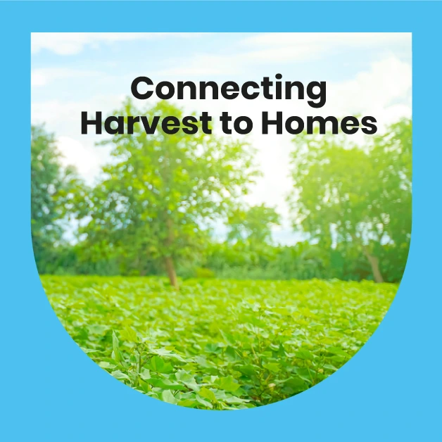
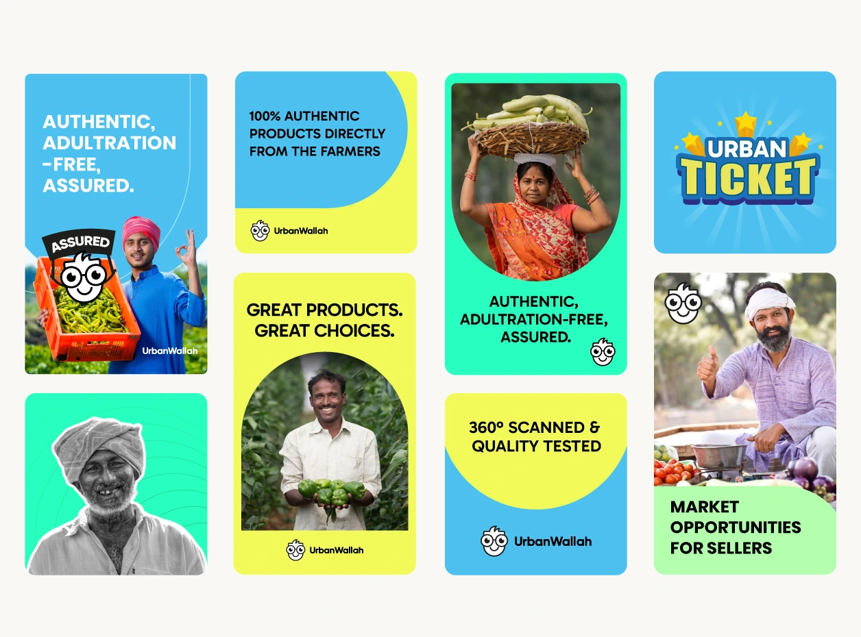
The broader visual language featured a palette and style that evoked clean, fresh, and ready-to-go qualities vital to any marketplace. Paired with the messaging theme "Fulfilling Life".


THE IMPACT
A Trusted Identity That Clicked with Consumers
The refreshed branding helped Urbanwallah break through noise and skepticism. The mascot became an instant recall asset, while the clean and smart design system earned user confidence. With increased brand adoption and a growing customer base, Urbanwallah’s transformation from just another tech platform to a reliable marketplace in the local community.