Br Communication
Creating a consistent visual language and
a memorable user experience for Br Specialities.
THE NEED
Br Specialities, an established dyestuffs manufacturer, based in Haryana, sought a visual language that would convey its brand values consistently and pleasantly. Being in the industry for four decades, the company had already carved out a niche in textile chemicals. The company has redefined itself as a responsible and progressive chemical manufacturer that caters to the needs of the 21st century.
What we did ?
- Brand Communication
- Event Branding
- Brand Website

The client was concerned with the inconsistency prevailed throughout their visual identity.
BRAND CHALLENGES
Br Specialities as a brand required a unique visual language that would communicate their purpose, values, and vision. They wanted to distinguish themselves from other players by positioning themselves as a responsible and progressive chemical manufacturer. However, they were concerned with the inconsistency that prevailed throughout their visual identity, which is a distinguishing factor for a brand. This inconsistency kept the audience from recognizing Br Specialities in the market that is filled with noise. They sought a functional and pleasant visual language that would touch every aspect of their business from packaging to letterheads to website to office interiors.


WHAT WE DID
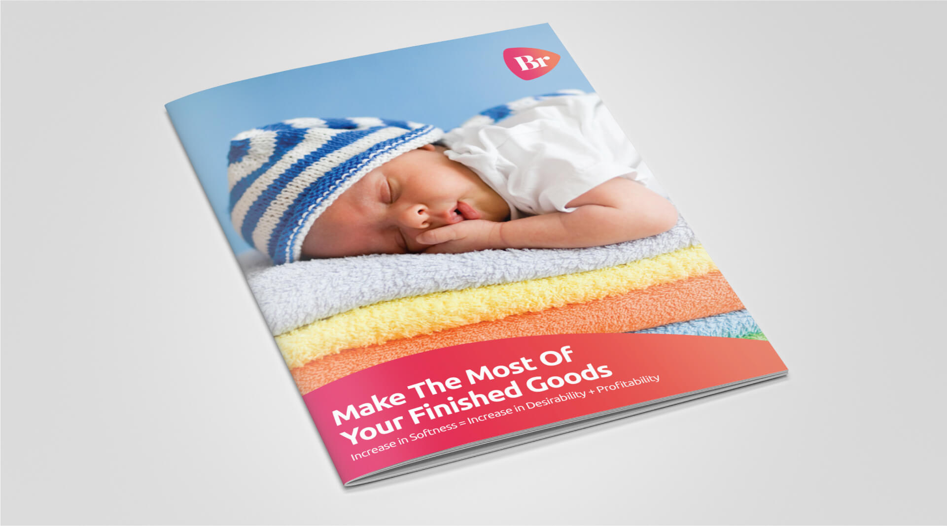
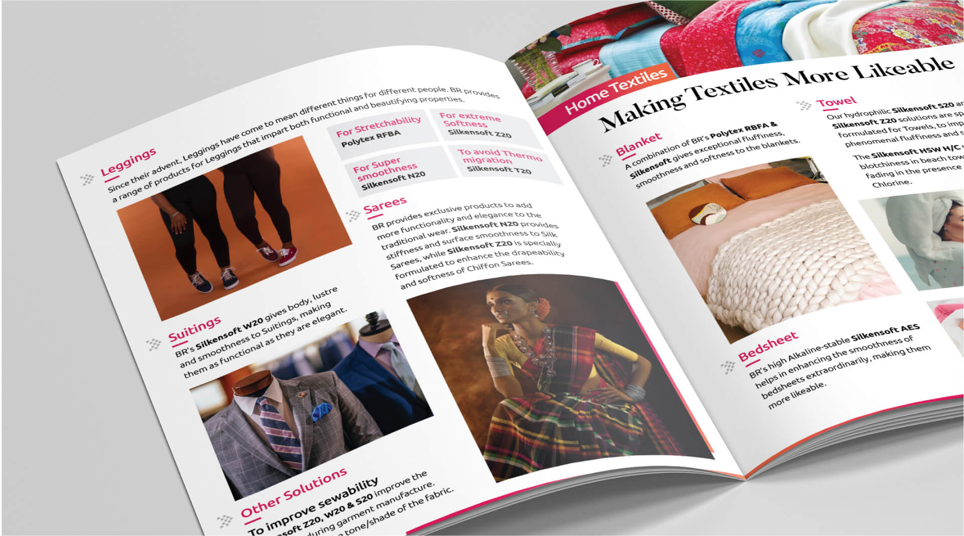
For the brand communication to be seamless and sharp, the visual language should be consistent.
Working with Br Specialities, we wanted to achieve two goals:
- To change the way the company had been perceived by the audience in the market.
- To enhance the audience’s experience.
To achieve both the goals, we created a visual language that is both expressive and functional. We believe that for a brand like Br Specialities that has strong values and purpose, the brand communication should be seamless and sharp. And for the brand communication to be seamless and sharp, the visual language should be consistent. So we ensured that regardless of the medium – be it print or digital – the visual language of Br Specilities is consistent and clear. This helped the audience not only recognize the brand but also connect with it.
Sri Eshwar’s blue and yellow were retained and other colours were deliberately limited to reflect a sense of focus. A versatile iconography was designed to match the institute’s explosive growth, which can be used in multiple settings. Our branding also extended to ideating and designing for newspapers and other ad outlets which turned out to be massively successful.


The Impact
An elegant and expressive visual language helped Br Specialities to convey the idea of a modern and progressive chemical brand. By incorporating the brand values of the company, we created a visual language that changed the audience’s perception of a chemical manufacturer, whose imagery often includes machinery, stained factory walls, chemical processing, and men in PPE. By ensuring its consistency, we helped Br Specialities give its audience a pleasant and memorable experience.

Springboard Team is really helping Br and Briskers achieve the potential and helping create a positive perception. #thankyou
Team Springboard brings a lot of creativity through Sriram and strategy and calmess through Vinodh. Team Springboard really wants to make good brands and not just limit themselves to the standard practices followed by the industry.


