Red Foodz
The Chikki Brand Visually
Rebranded to Elicit Nostalgia
THE NEED
Identity in an Unorganized Market
Red Foodz is a growing Chikki brand striving to penetrate the unorganized Chikki market. With few players as competitors, Red Foodz needed visual brand positioning to distinguish itself in the aisles.
What we did ?
- Brand Positioning
- Branding
- Brand Visual Language
- Brand Packaging
VERBAL BRAND POSITIONING
Good is Back
When asked, “what is the dearest memory of having a Chikki in childhood?”, most answers would be about hands picking the chikkis from the jar of Kirana stores. Where did all the fun go? As chocolates invaded this space, Red Foodz Chikki is the effort to bring this goodness back, positioning it as our nostalgic snack. Our goal is to encourage healthier snacking habits by promoting our native snack to compete with both chocolates and unbranded Chikkis.
VISUAL BRAND POSITIONING
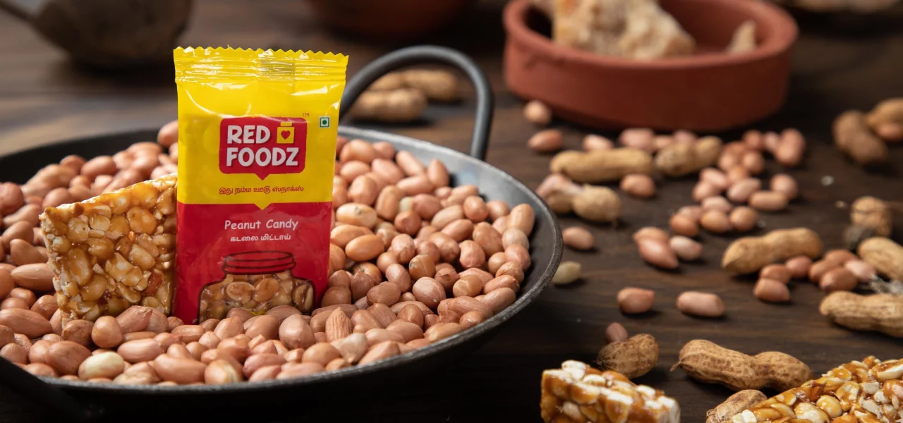
Package of Transparent Jar Design
We wanted to evoke this nostalgia and communicate it through the package design. So, we tried to position the brand visually in the minds of the audience using the transparent part within the shape of the Jar in the Package, so that chikki inside is visible outside like Kirana store jar of chikkis.


The Imact
Surge in Sale with its Nostalgic Appeal
After the visual rebranding, hands picking up the Red Foodz Chikkis surged at the Cash payment desk of Department stores. The sudden recognition of the packaging's nostalgic appeal had a favorable influence on consumer actions, resulting in an increased interest and purchases of the product.


